BEM, or “block, element, modifier,” is a popular naming convention for classes in HTML and CSS. It was developed by the team at Yandex, and its purpose is to help developers better understand the relationships between their structure and styles. On top of this, it has many side benefits, and its use can directly benefit a team setting, such as standardizing naming practices and modularity – both of which we will dive deeper into momentarily. However, we must first understand what the methodology entails.
Building your Blocks with Elements and Modifiers
BEM, starts with a basic naming convention as follows: block__element–modifier. This may not make much sense to begin with, but hopefully we can clear that up. Let’s take a look at each piece step by step, then we’ll look at an example.
First, block. Block should be considered as a top level component, almost like a parent. An example of a block, denoted in css, could be .btn{}
Within a block, we have child elements. Child elements reside in a block, and are stated with two underscores following the block. Following along with our button theme, elements could be as follows: .btn__icon{}, and .btn__text{}.
Now, before we get into modifiers, I want to reiterate what is happening here. We have a button block, which contains two elements: icon and text. Looking at it from an html perspective, we have the following:
Continuing with our css, we have:
So we can see that we now have a button component, and a base naming convention to get the styles we desire. This is where modifiers come in and really make BEM an awesome methodology in my experience. A modifier, does exactly what is says, it modifies the presentation of a Block or Element. For example, we know that anything we add the class btn to will get a padding of 5px and a fixed width of 200px. So what happens when we need a button that has all the same styles that our btn class defines, but instead of a fixed width of 200px wide, we want a button that spans the full width of its container? Well, you could define a whole new class called full-btn, copy the styles we want from our base .btn, and implement child elements, but that seems tedious as well as redundant. Instead, we can opt to make a modifier for the .btn class. To make a modifier, we can follow the block or element name with two dashes and add the modifier name. In our case, we want to modify the btn block to allow a full width option. I can achieve this by adding the class, btn–full, to the btn block. Now, our html for the btn block looks like this:
You may be wondering why we have both btn, and btn–full stated, and this is because, in our CSS the btn class has all of the styles for the button that we need. The btn–full is only for overwriting, or modifying, the width value. The modifier adds tons of options and customization, all while staying within a standardized naming convention.
Using BEM as more than just a naming convention
Before we continue on, I think it is worth noting that everything we have covered thus far, is simply a naming convention. BEM itself does not change the way CSS or HTML works or how they’re parsed. It’s just more of a defined way to name things, and creates a relationship between elements and their respective styles. It’s that relationship that I think really brings forth the benefits of BEM in team settings, as well as in a development setting that focuses on modularity.
From here we will discuss those benefits further as I dive into why my team uses it, and how it has enhanced our development on the front end. Another important note, from this point forward, I will be discussing BEM and how it can be used alongside a CSS preprocessor such as SASS, or Less. If you are unfamiliar with either of these CSS tools, I implore you to check them out as they are truly becoming a standard part of our toolkits, and they are an all around quality of life in front-end development.
Now, back on track to my team, how we discovered BEM, and why we stuck with it.
When I began my journey with Sharp Notions two years ago, we were a pretty small team. Small enough, that if I had a question about why something was named a certain way, or placed where it was in the code, I generally just had to lift my head up and ask Megan – one of our experienced front-end developers. That being said, while there was a general organization and a few internal naming and locations standards, it wasn’t exactly concise, or easy to remember. Fast forward several months, and our codebase was starting to get sloppy. We had just hired another front end developer and we all had our own ways of naming things. This was especially frustrating in a team environment, as we are always jumping onto one another’s projects to help out with various tasks.
Falling in love with BEM
It was around this time that I had been contracted out to do some front end work with another company for about a month. Let me tell you, they were on top of it. Organized beyond belief. It was here that I was introduced to the BEM methodology, and would later introduce it to the team back at Sharp Notions.
Initially, BEM was met with some hesitancy. Whether it was fear of change, or just thoughts that it wasn’t useful, it took another month or two to finally get the switch to BEM to happen. Once it did, operation organize was underway. We overhauled our entire system. We had weekly front end meetings discussing the ways we would use BEM and common class names we would use. On top of this, we adopted a highly modular file and folder structure using SASS. This meant great things for our team and solved a ton of daily frustrations.
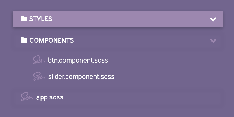
File structures and modularity, the BEM way
Why the change to a modular file structure? Well, I think that without a modular structure, BEM loses a lot of it’s purpose. BEM is built around the idea that you have these reusable blocks. Plus, with the use of modifiers, BEM itself leans toward this modular ideology.
Think about our button code above. Out of the box, we get this fully styled button. However, we can also make all of these modifiers- modules if you will, that we can attach and change the base style to exactly what we need. It only makes sense that we also modularize the file structure around it. Take our button, for example again. The .btn class, defines a button block, or a component. So inside of our styles directory, we should have a components folder, that contains a SASS file named after its block, btn. This makes it especially easy to figure out where and what class names are doing. For example, if I am working on a project that a coworker has mostly developed, and I come across a section of code that has a block name of ‘slider’, and an element ‘slider__slide’. I can right of the bat assume that the block defines a slider container, and that the slider__slide element is where I will find the details pertaining to each individual slide. On top of that, I know that if I need to make a change, I will probably find a file called slider within the components folder.
I can now easily see what the SASS is doing, as well as see if there are any existing modifiers to handle the changes I need to make. It’s as simple as creating one for me to get my desired changes if those modifiers don’t exist. This is much better than opening a single style sheet and having to do a find command on the class I am looking for. Especially if the code in that file is not organized and various class names appear all over the place. By taking on the modular approach, you really eliminate a lot of the headache that comes with messy, long style sheets.
All in all, BEM is a great way to get your front end team organized and writing clean concise code. There are many similar methodologies out there, and I am not going to make an argument for or against any as they all share similar principles and aim to achieve the same goals. The only argument I have to make is that, if your front end team is not using any naming conventions, I strongly recommend to try one out. They will quickly enhance your workflow, as well as relieve some disgruntled developer nightmares.